Subway tiles, marble, oh my!
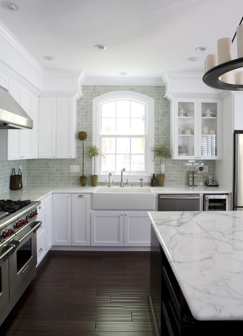
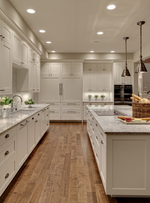
Contemporary Kitchen design by Seattle Interior Designer Shuffle Interiors
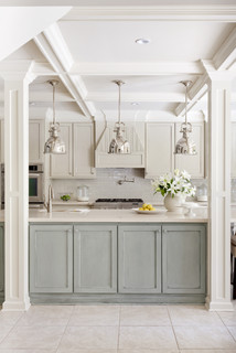
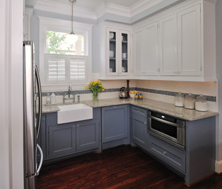
We knew we would be keeping our base cabinets and liked the idea of painting them a light gray
We knew we would be keeping our base cabinets and liked the idea of painting them a light gray
We also have found tons of inspiration in This Old House Magazine
This recent kitchen article was inspiring
 |
| I really love the wall color in this space! |
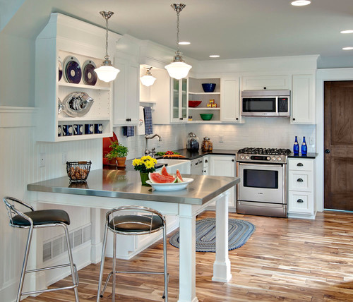
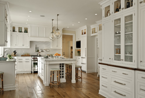
- a mix of classic/retro with some clean, modern touches - nothing TOO trendy, or TOO cookie-cutter
- whites and grays to not have TOO much contrast in our small space
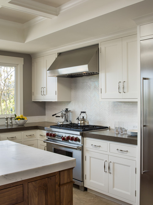
- I wanted some marble somewhere! It's luxurious and classic.
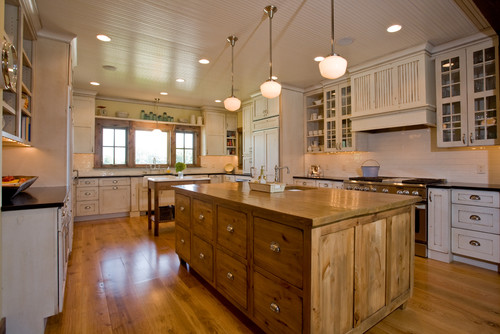
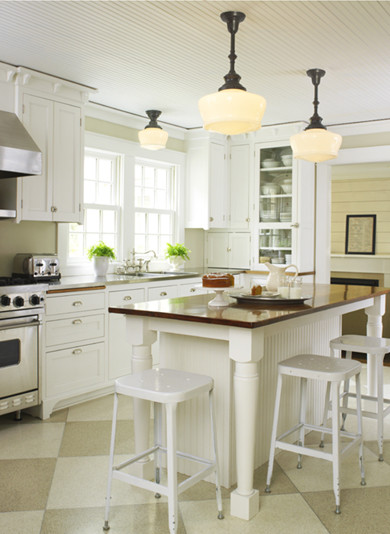
- beadboard ceiling
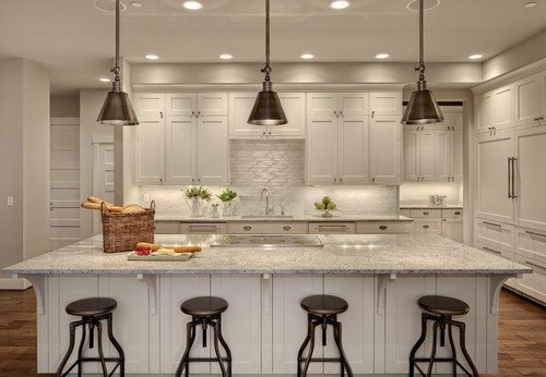
- school house/retro lighting
- subway tile, but not just the basic white 3" x 6"
- marmoleum or hardwood flooring
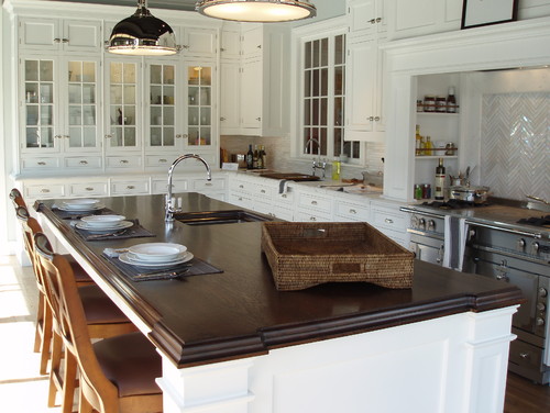
- a focal area of backsplash


No comments:
Post a Comment